Summary
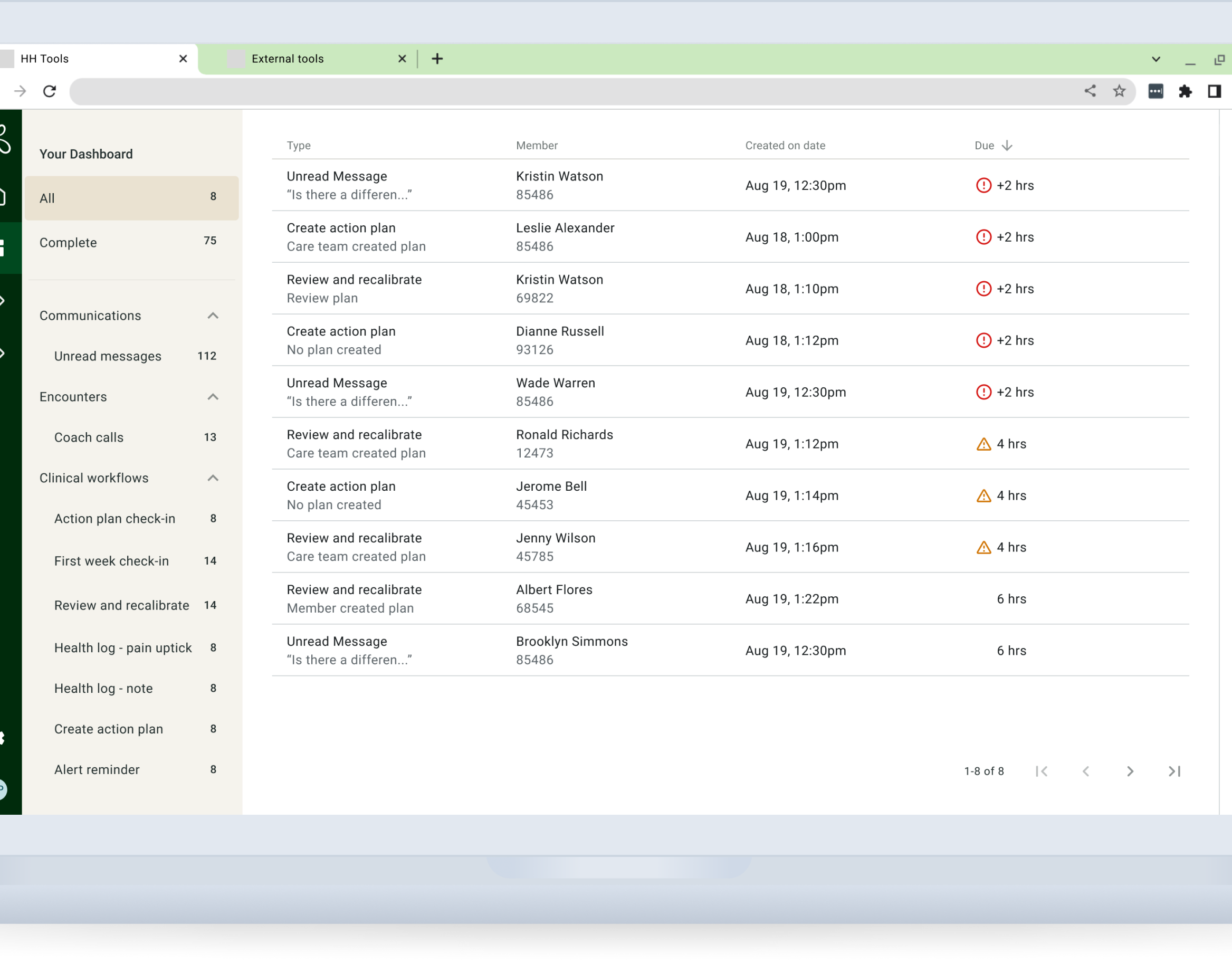
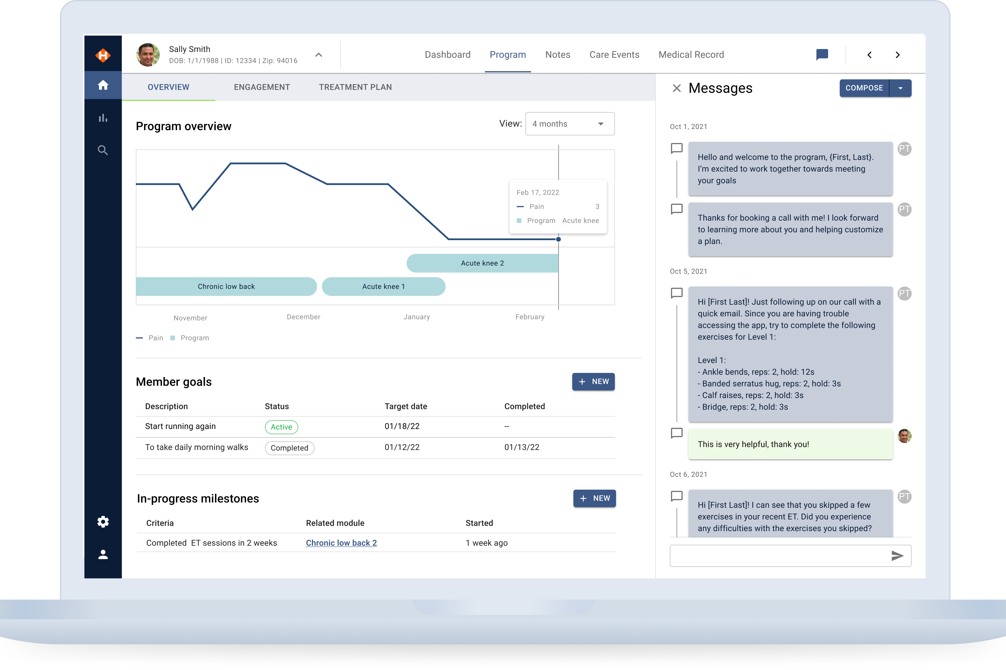
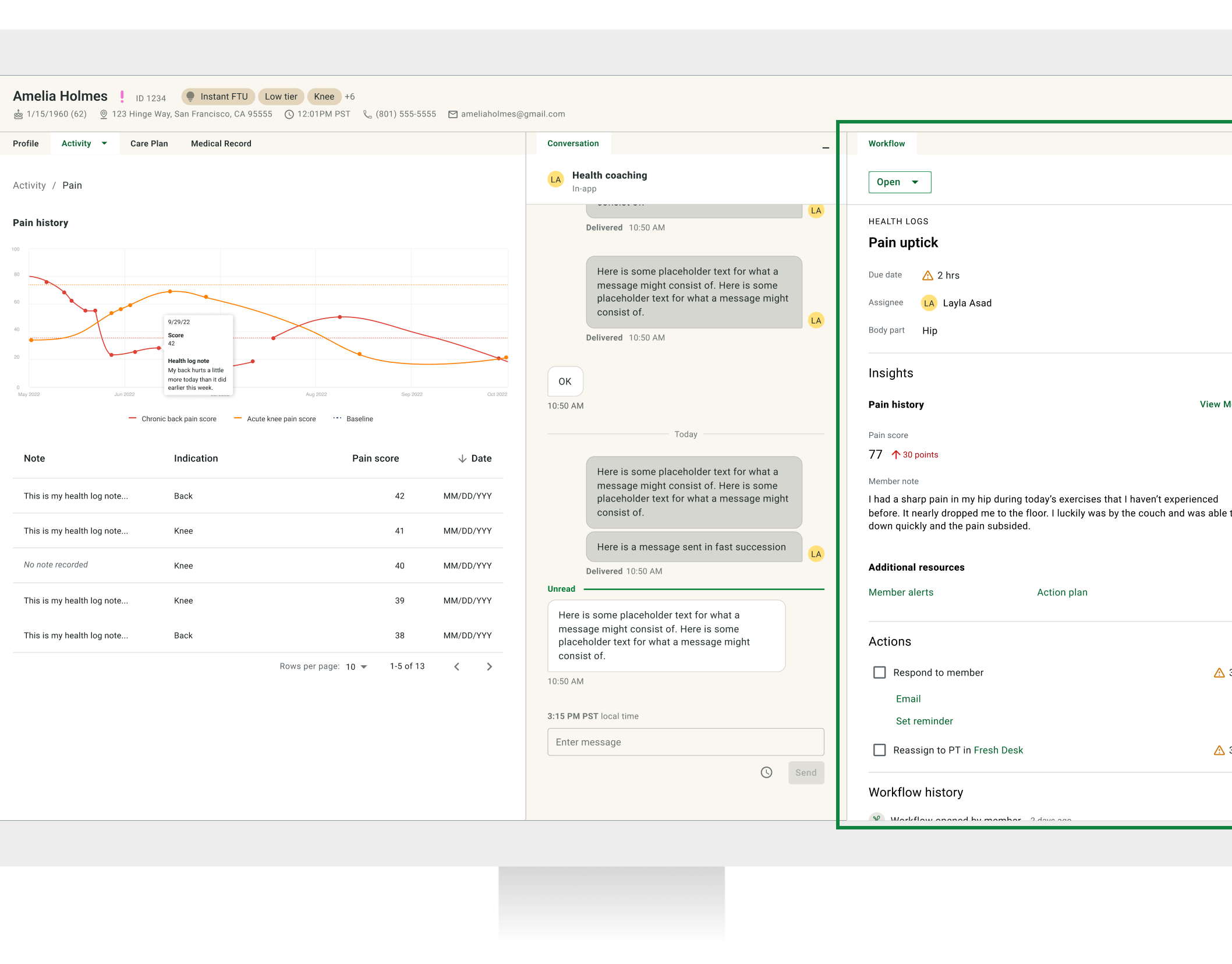
At the beginning of 2022, Hinge Health initiated a design sprint to enhance care team productivity by reimagining its three care team products (CTP) as a unified EMR/CMS tool. The goal was to provide a data-rich record tailored to coaches, physical therapists, and nurse practitioners, improving overall efficiency and user satisfaction.
The problem
The Hinge Health care team has diverse roles, which required careful organization of data to meet specific needs. The challenge was to create a flexible information architecture (IA) that could cater to different roles while also allowing for future scalability and expansion of services.
The solution
The project aimed to define the IA that enhances care team specialists' productivity, job satisfaction, and, ultimately, the overall product quality. The focus was on creating a holistic member experience through well-organized data and editable patterns.
Constraints and dependencies
• Differing data needs for each care team specialist
• Uncertainty about data presentation and editability
• Simultaneous development of the product framework alongside IA
Role
I collaborated with another product designer to define the strategy, lead user testing, prepare prototypes, and generate documentation for stakeholder meetings.
The process — Discovery
Card sort
We conducted a card sort using existing data points to understand how care team specialists organize data. During the design sprint, we identified five categories and tested them through a closed card sort with two specialists from each role to observe their sorting methods and collaboration.
From the card sort, we found that:
1. Relevant information is essential for personalized outreach to members.
2. Care team members require a comprehensive view of member activity across various data points in one place.
3. Each role wants an overall view of the member record while having the option to narrow their focus using filtering.
IA Mapping
We used the card sort findings to create a site map. To organize data for three care team specialists, we opted for a deep hierarchy to arrange data points in each section concisely.
The Process — Ideation
Create wireframes and test.
The initial wireframes were derived from the site map, but some sections required further breakdown. The overview page became a catch-all for all roles. The wireframes underwent three major iterations and testing.
Filtering remained important after testing due to the data volume. Some sections catered more to specific care team specialists, highlighting the need for a better hierarchy in other areas.
Member overview: The first iteration had an overview section that displayed a mix of data that we thought would be helpful for all care team specialists
Member overview: The second iteration removed the overview section and added a profile section that displayed enough information for them to personalize their interaction.
Edit patterns
Before starting the visual design, our team focused on exploring edit patterns. Though only a few data points were editable, it was crucial to establish data standards as we created larger forms. Our objectives included defining the edit pattern, identifying destructive edits (which cannot be undone), and analyzing their frequency.
Through competitive research, we found that editing by section and inline were the most common methods. We conducted user testing with a coach, physical therapist, and nurse practitioner, who all preferred inline editing, especially in tables or cards. They favored section-level editing over individual data points and appreciated added protection when changing key member details like phone numbers and addresses.
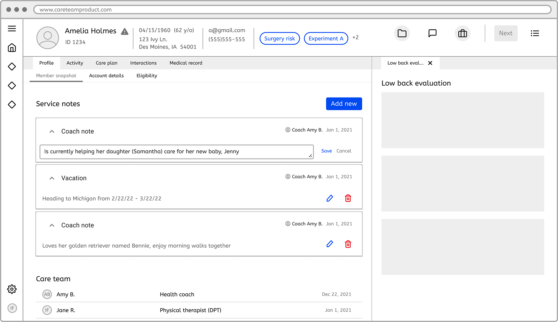
Inline editing of service note. Care team specialist can access from icons where they can edit or delete
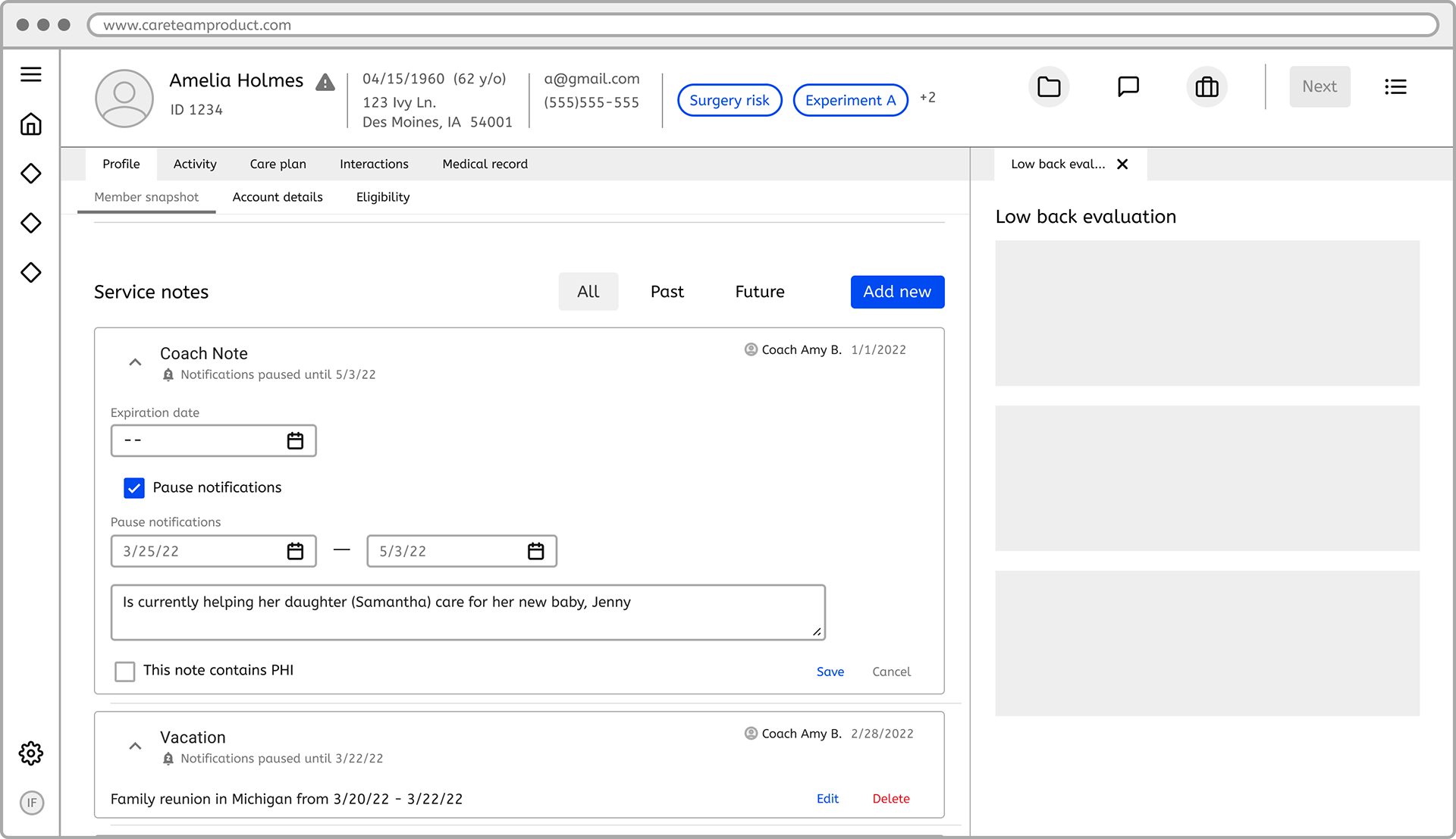
Updated service note edit fields for more robust editing
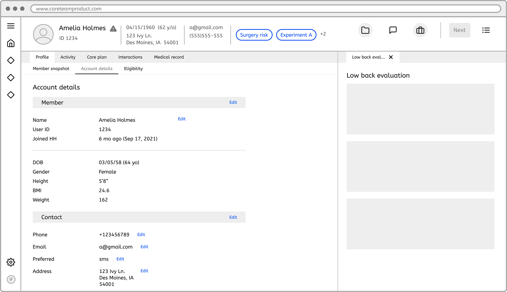
Account details editing from section and individual data point
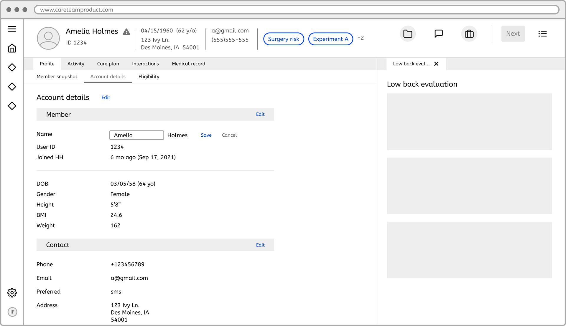
Account details editing from page and section level
Results and conclusion
The iterative process revealed the challenge of finding a standard layout for diverse roles. Insights from testing guided the creation of an IA that aligns with the needs of each care team specialist, setting the foundation for an optimal MVP.
The next steps involve translating these insights into the visual design and implementing the finalized IA into the product framework for a seamless and user-friendly experience.

