Summary
In the process of reimagining a new electronic health record, the internal tools product team identified the need for a unified design system. I collaborated with the engineering team to identify an open-source design system that would serve as the foundational framework, allowing for further customization as the internal products were developed. After evaluating various design systems, we determined that MUI was the most suitable choice due to its strong community support, existing Figma library, and suitability for enterprise-level products.
The Problem
The internal tools product team required a robust design system for care team dashboards and patient records to:
• Deliver shared components more efficiently
• Ensure consistent design across care team products
• Utilize a well-tested, supported interface library
• Promote cohesion in building shared components and upholding design standards.
The Solution
We identified four open-source design systems we could use immediately and customize further. These design systems required the following criteria:
• Strong community support
• An existing Figma library
• Suitable for enterprise-level products or customization to meet these needs.
After evaluating Fluent, Ant, Carbon, and MUI against these criteria and considering the immediate and ongoing costs of each, we have determined that MUI is the most suitable option.
Constraints and Dependencies
1. We are limited to a design system library that supports dense layouts and components.
2. The development will be concurrent with the framework and information architecture designs.
3. Layout decisions depend on final framework decisions and monitor size.
4. Components and customization depend on information architecture (IA).
Role
I prepared research and documentation and scheduled stakeholder meetings to ensure effective communication and alignment throughout the project. I also collaborated closely with the engineering team.
The process — Research & Comparison
We established a set of design and technical criteria to help us find the best open-source enterprise-level design system. Based on these criteria, we explored Fluent, Ant, Carbon, and MUI:
Design requirements
• An existing Figma library
• Comprehensive design documentation
• Dense component variations.
Engineering requirements
• High community support
• Small bundle sizes
• Maintainer trust.
Component Audit
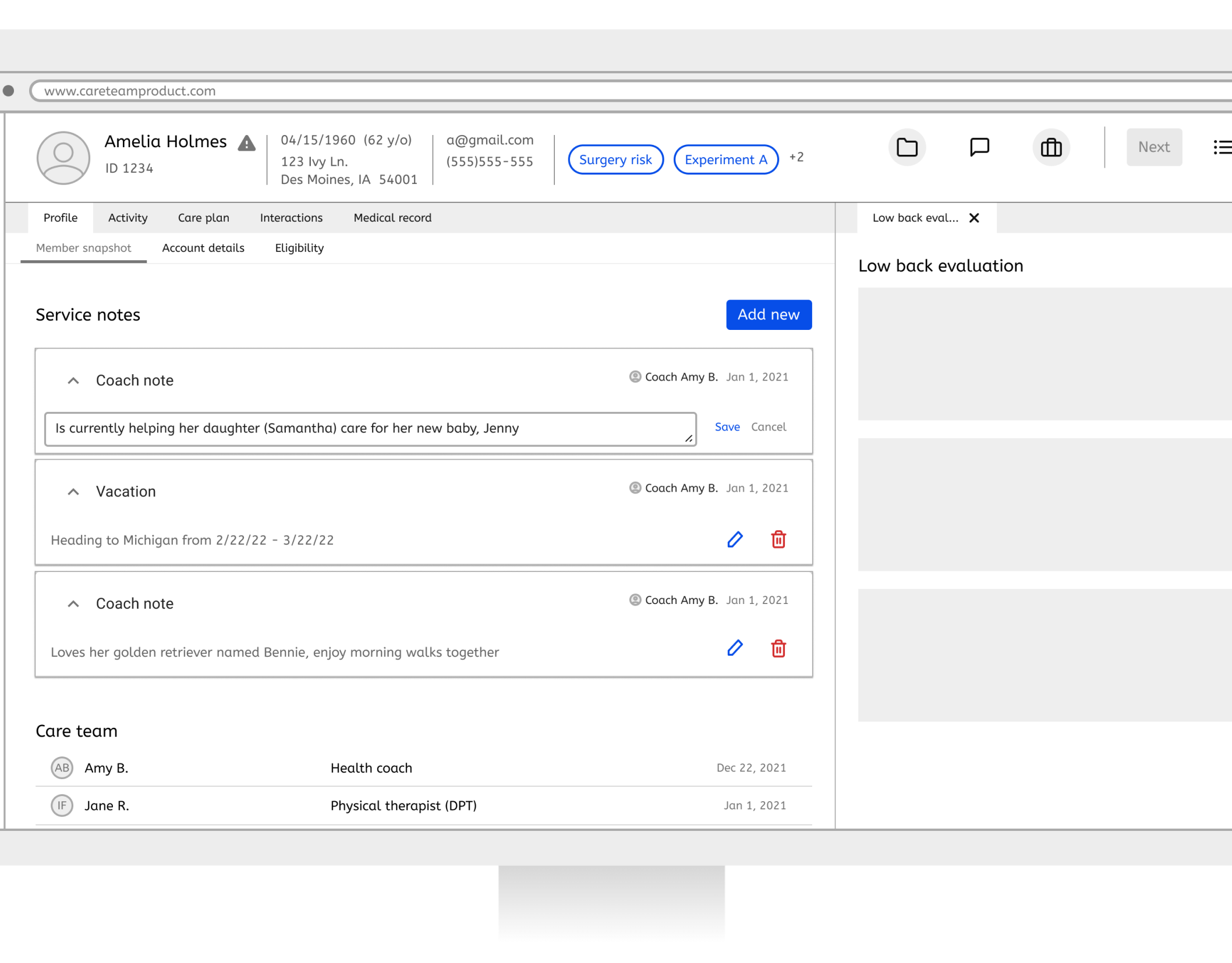
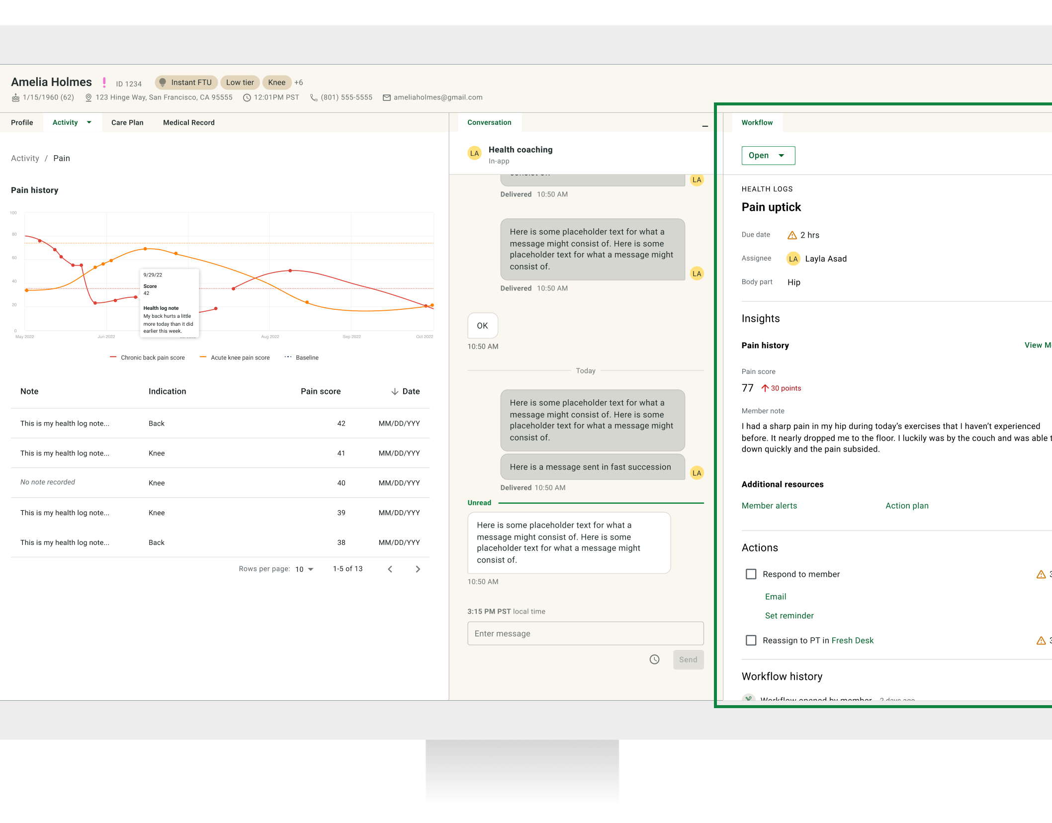
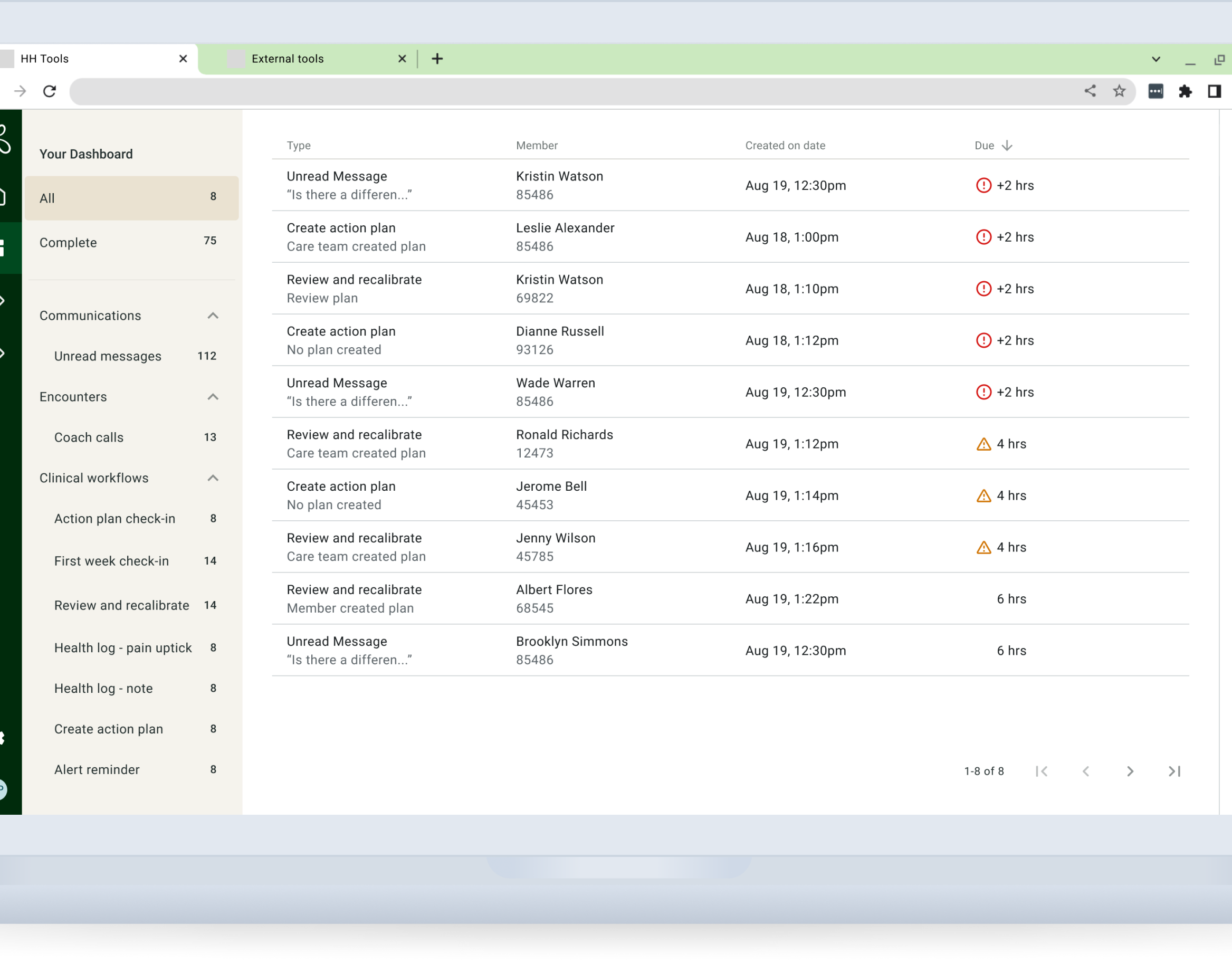
Compared open-source design systems with the existing internal tools and the early explorations of the new electronic health record.
Created a sticker sheet showcasing both "out-of-the-box" and customization options.
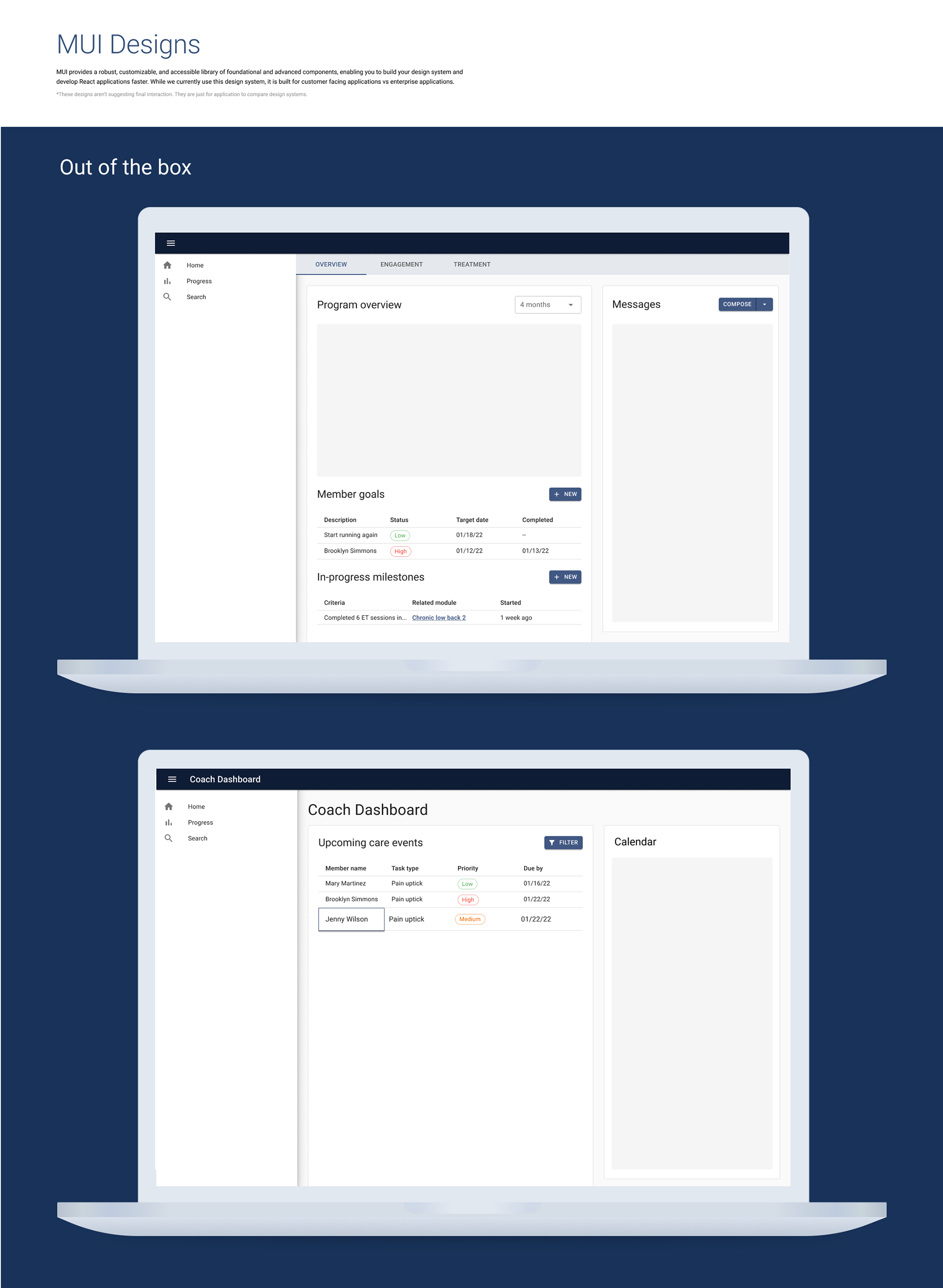
Dashboard using out of the box MUI components
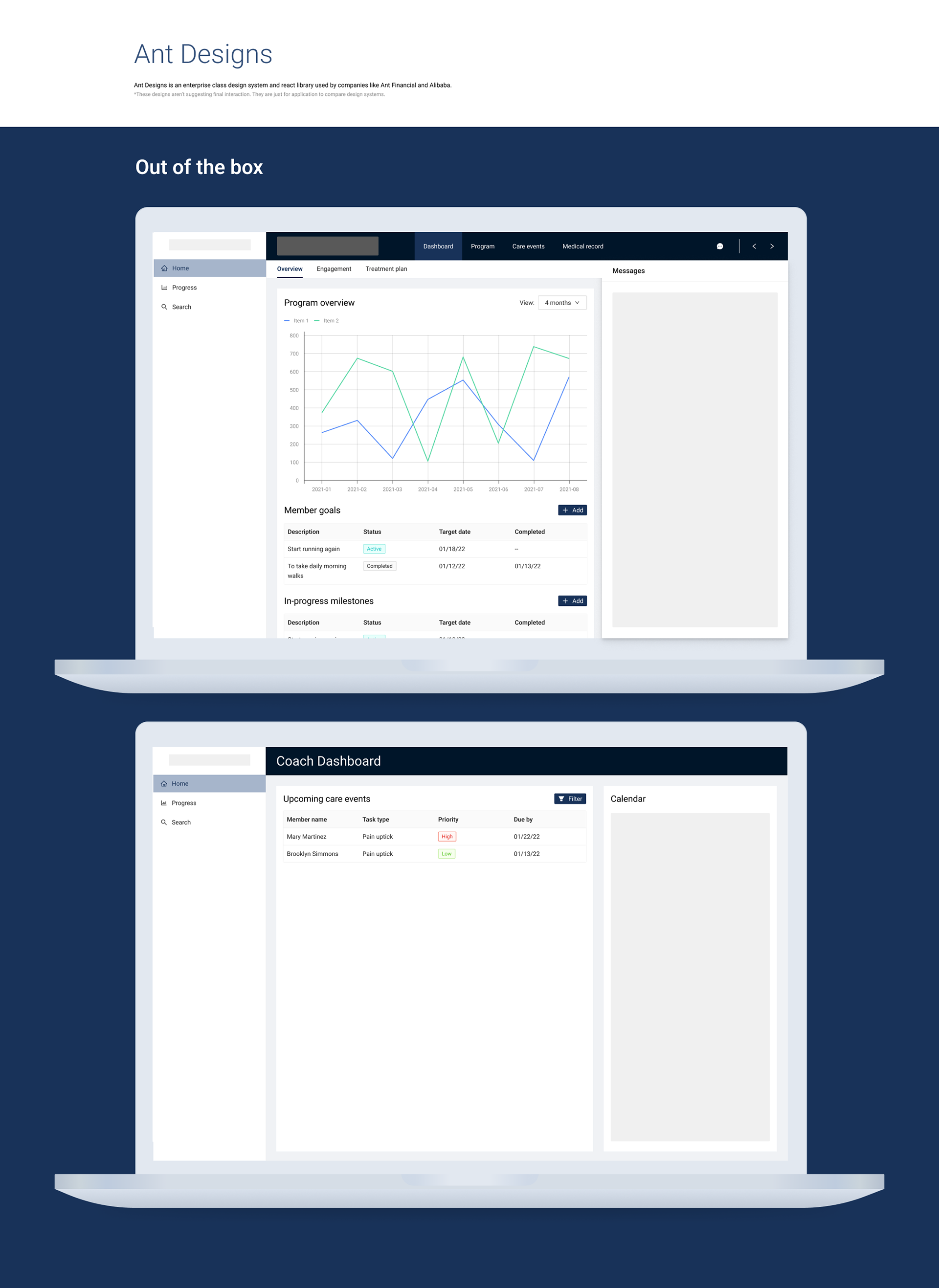
Dashboard using out of the box Ant components
Cost Assessment
We evaluated the immediate and ongoing costs associated with each design system. We discovered that MUI is primarily designed for consumer-facing products, but it is highly customizable to meet our enterprise-level requirements. However, this customization will result in significant immediate costs, particularly for less dense components. Although the upfront expenses may be higher, we must also consider the ongoing licensing fees, the potential for breaking changes with major updates, and the increased costs associated with denser components.
The Process — Initial implementation
We prepared and shared a final document explaining our decision to use the MUI design system. This document was created as the source of truth to highlight why MUI was chosen, potential risks, mitigation strategies, and FAQs.
Engineering and design created a detailed timeline for customizing the MUI design system to fit our brand. This work needed to happen alongside framework designs and information architecture, ensuring a coordinated and efficient process. We also needed to prioritize certain design system components based on milestones for other parts of the product to ensure a smooth and timely design system implementation.
Results and conclusion
We concluded that MUI was the better fit for our needs. Although it isn't an enterprise-level library, it offers dense components, is supported in Figma, and has high community support. Ant Designs was a close second as an enterprise-level design system, but it fell short due to security issues, large bundle sizes, and language barriers.
The next steps were to begin customizing the MUI design system by defining breakpoints and theming.
Learnings
Throughout the research and comparison process, we actively engaged with leadership. We shared our findings and proposed decisions, seeking their input and insights. This collaborative approach ensured that the decision-making process was transparent and inclusive and that the final decision was aligned with Hinge Health's strategic goals and vision.

