Summary
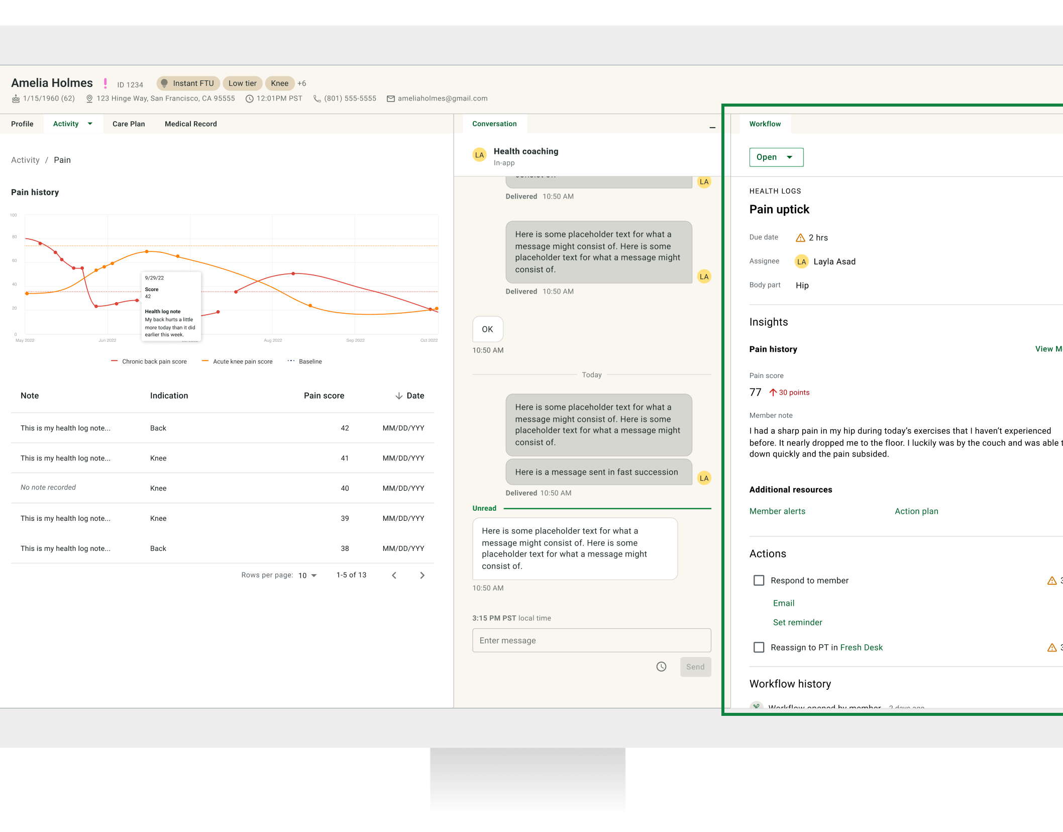
Initially, our team focused on enhancing the workflows and dashboard for physical therapy (PT). As we progressed to coach workflows, we identified the challenge of handling a larger volume of tasks with varying priorities. Coaches manage over 200 clinical tasks and messages across multiple tools, highlighting the need for a more efficient solution than the existing PT dashboard design.
The problem
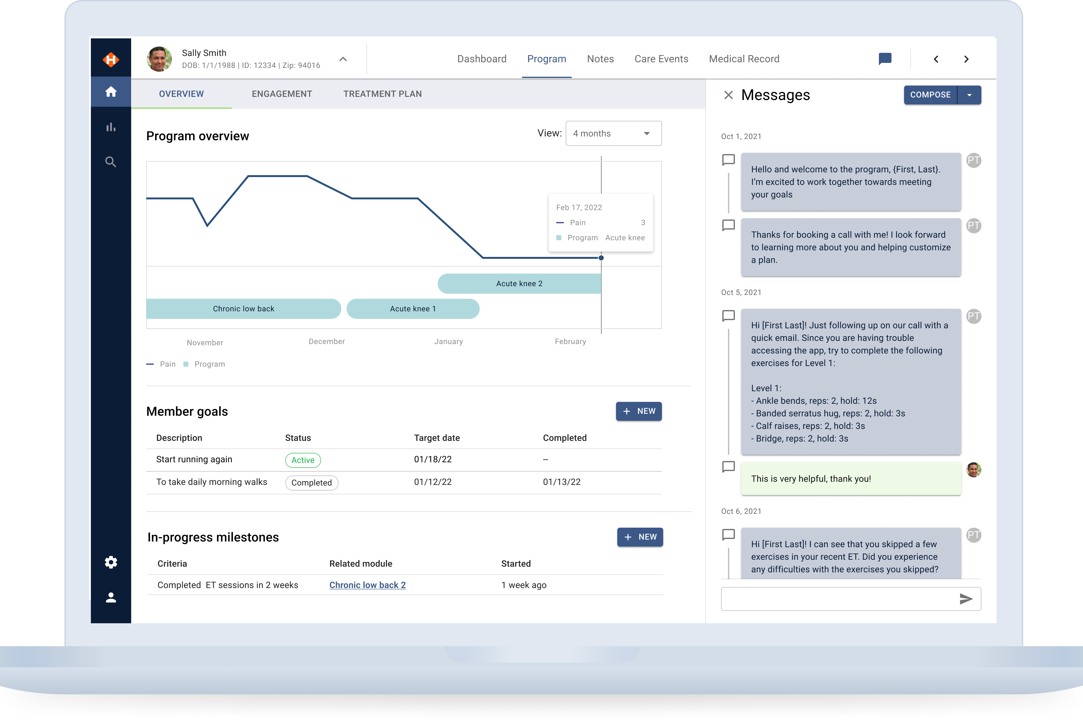
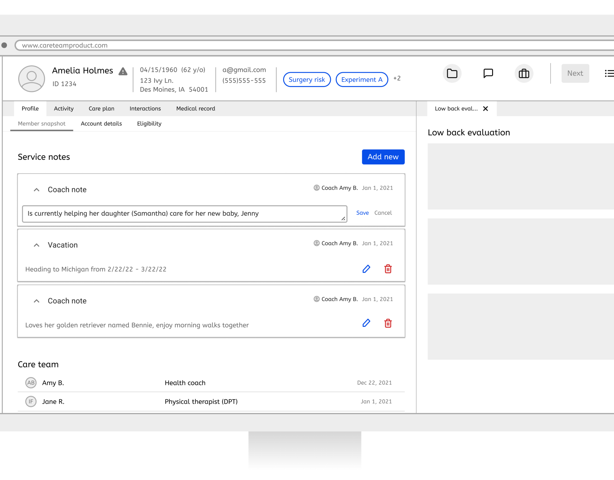
Health coaches, unlike physical therapists (PTs), do not have a dedicated dashboard to manage their ongoing workflows. Consequently, they must handle tasks using various tools across multiple tabs, which can be confusing and does not align with the key performance indicators (KPIs) relevant to their role.
The solution
We initially set out to adapt the PT dashboard design for health coaches but found that the current design does not meet their needs or priorities. I designed a dashboard that enables coaches to view and sort a large volume of tasks by workflow type, making it easier to manage high-priority tasks efficiently. The patterns from this new dashboard will be utilized to update the PT Dashboard.
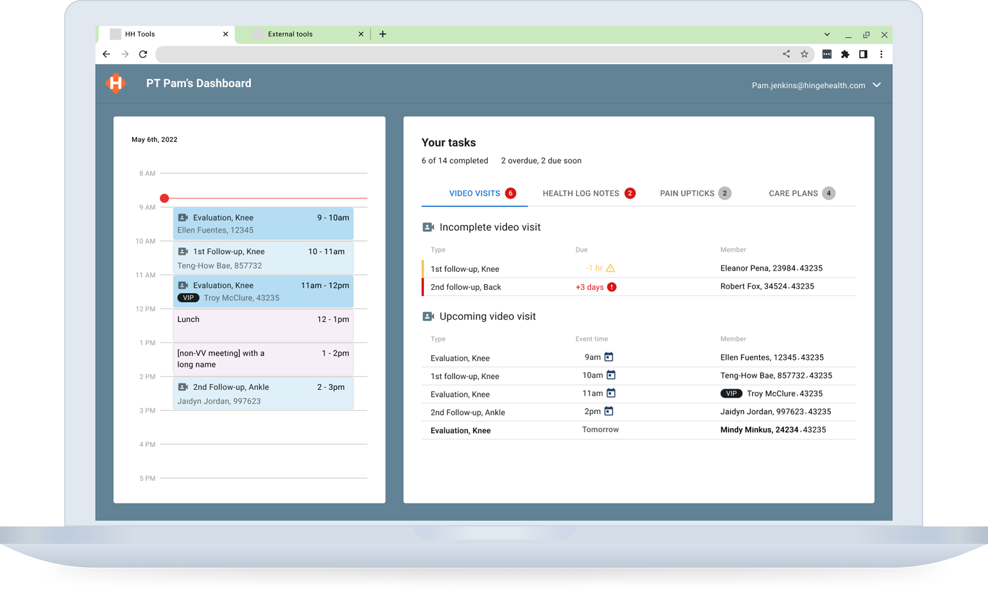
PT Dashboard
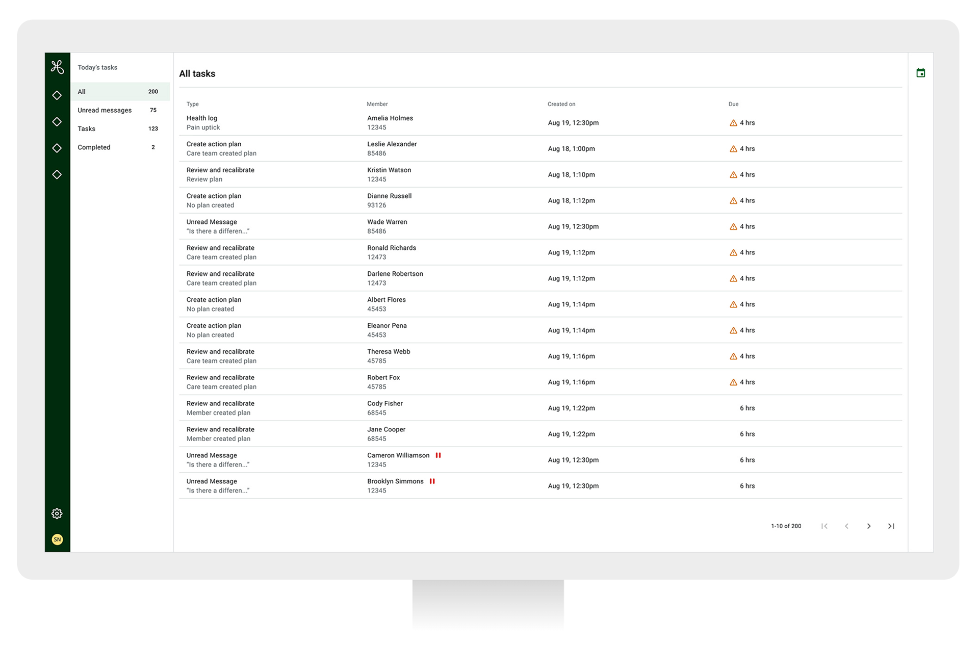
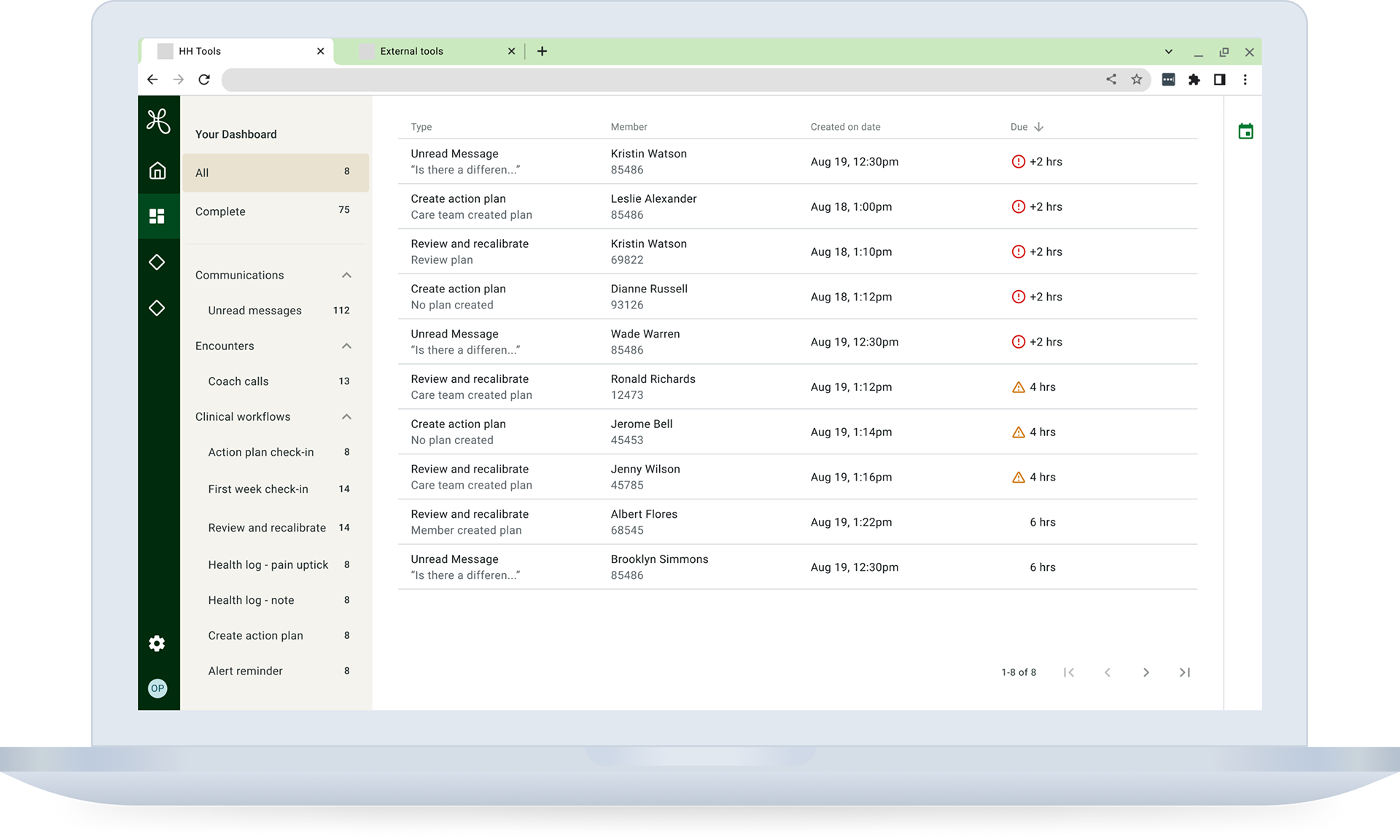
Coach Dashboard MLP
Constraints and Dependences
• High volumes of coach workflows caused performance issues with the coach dashboard, requiring collaboration with engineering to implement pagination for quicker loading.
Roles
I was the lead designer, partnering with the PM, engineering, coaching ops, and stakeholders for input and feedback.
The process — Discover
I collaborated with the project manager to define user stories and workflow priorities, realizing that existing patterns needed to be more suitable for coaching workflows.
User stories
I analyzed each user story based on our existing knowledge and possible solutions. Then, I reviewed it with the project manager and tech lead for confirmation.
Workflow priorities and grouping
Sorting was a crucial feature for both the PT dashboard and the Coach Dashboard. Given that the Coach Dashboard needed to manage over 200 workflows, we had to find an alternative solution to the sorting method used in the PT dashboard. I explored two options: shallow tabs and deep tabs. The shallow tab approach was similar to what was implemented in the PT dashboard, but we realized it wouldn’t be effective for the Coach Dashboard. Therefore, we opted for a deeper sorting layout. With this deeper sorting system, we also had to determine the priority of different workflows to ensure that the most important tasks were easily visible before others. As we built the dashboard wireframes, the layout and priorities continued to shift.
The process — Define
I explored several iterations, considering factors such as sorting by due dates and organizing workflows into tabs to identify the most effective approach. During this time, I collaborated closely with the coaching organization to prioritize workflows, define service level agreements (SLAs), and establish a shared understanding of relevant terminology.
We determined that Unread Message workflows were the highest priority and needed to be separated from other tasks.
I worked alongside the project manager and engineering team during the design process to address the complexities of sorting versus filtering and to enhance page loading performance. Early definitions of these requirements helped mitigate technical challenges and ensure the dashboard's functionality. I regularly updated neighborhood stakeholders and the design team to align user needs with business objectives.
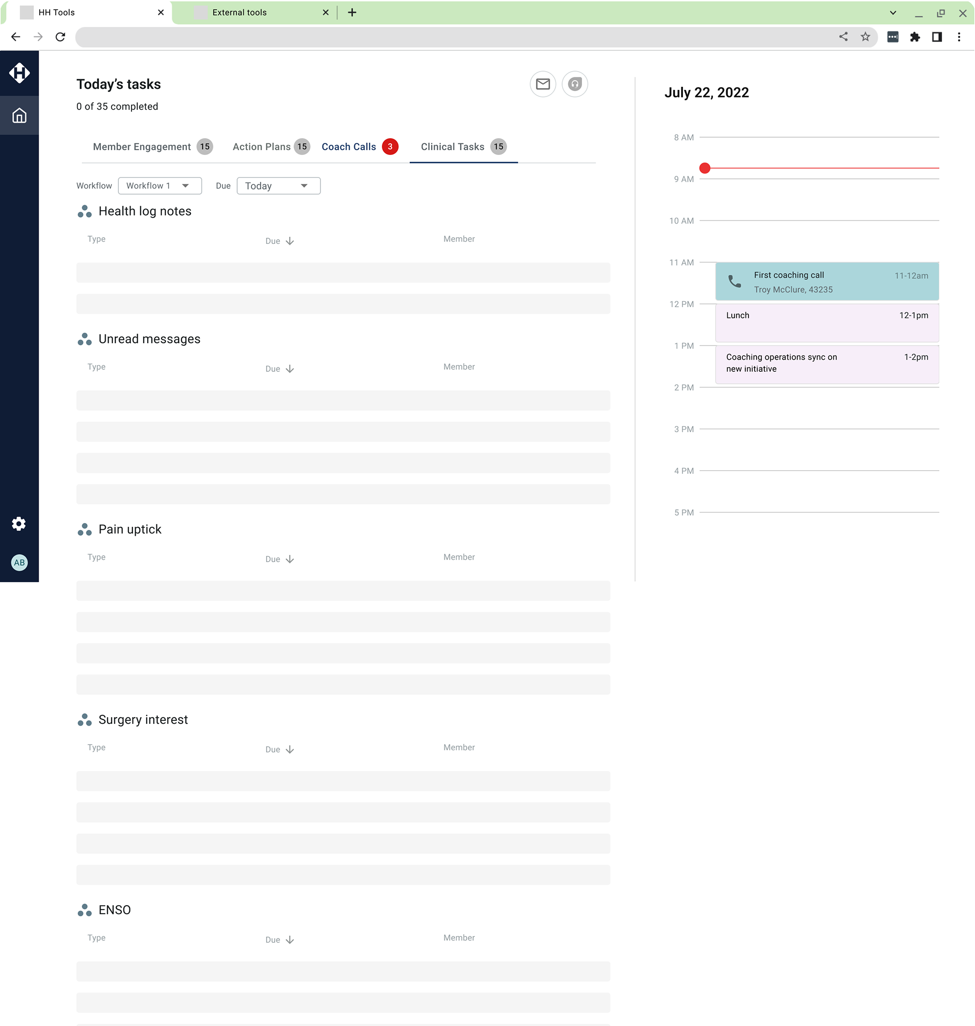
Similar sorting to PT dashboard
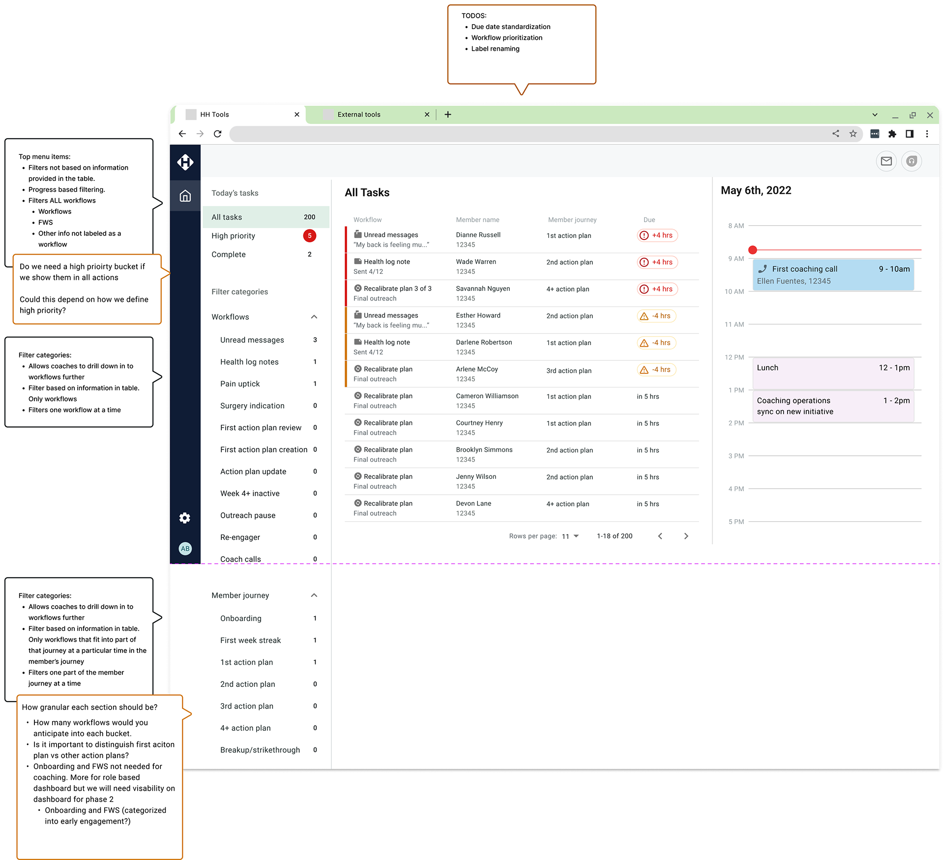
Using similar components as the PT dashboard but introduced sidebar filter
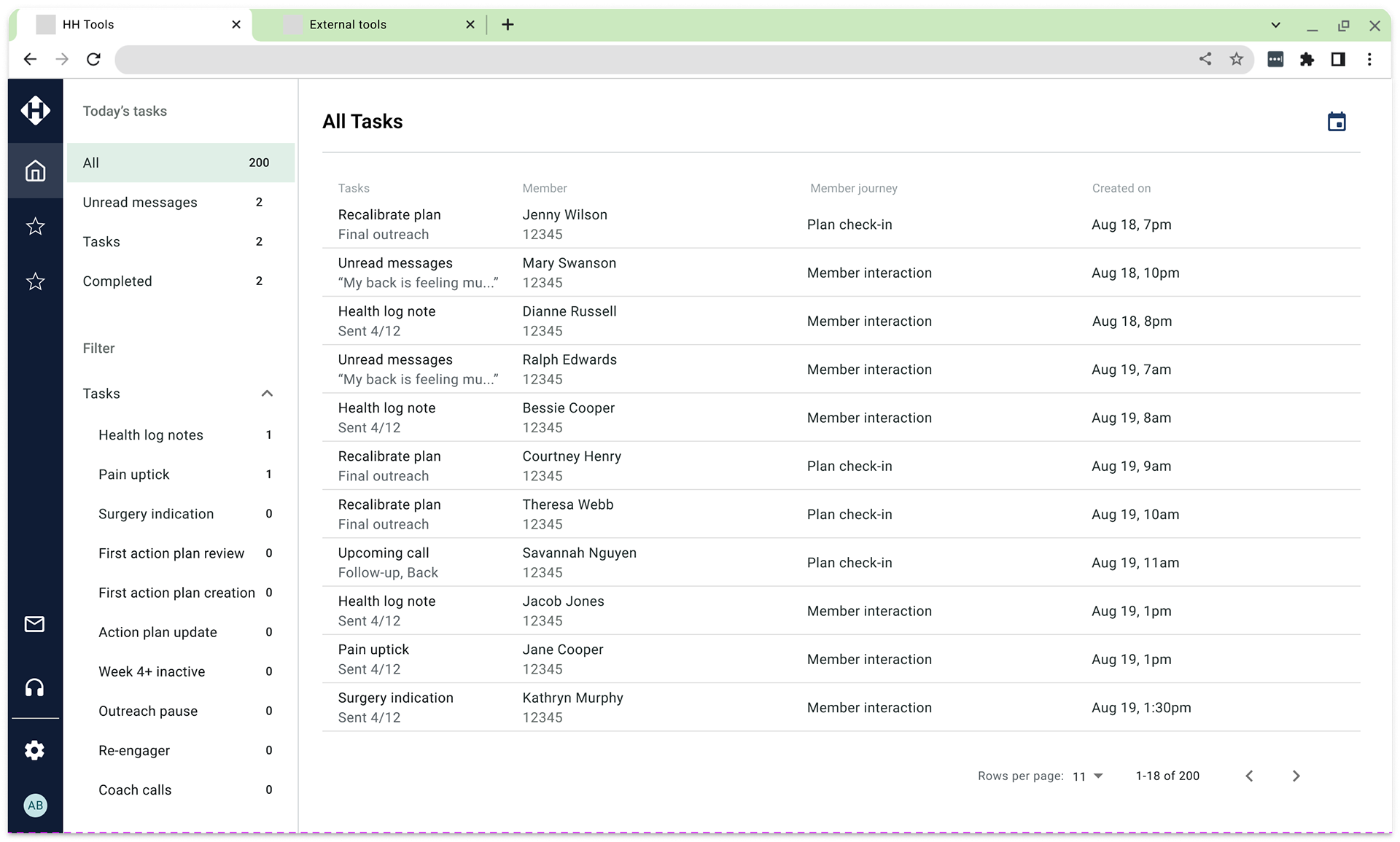
Added filtering categories under main sorting in the sidebar
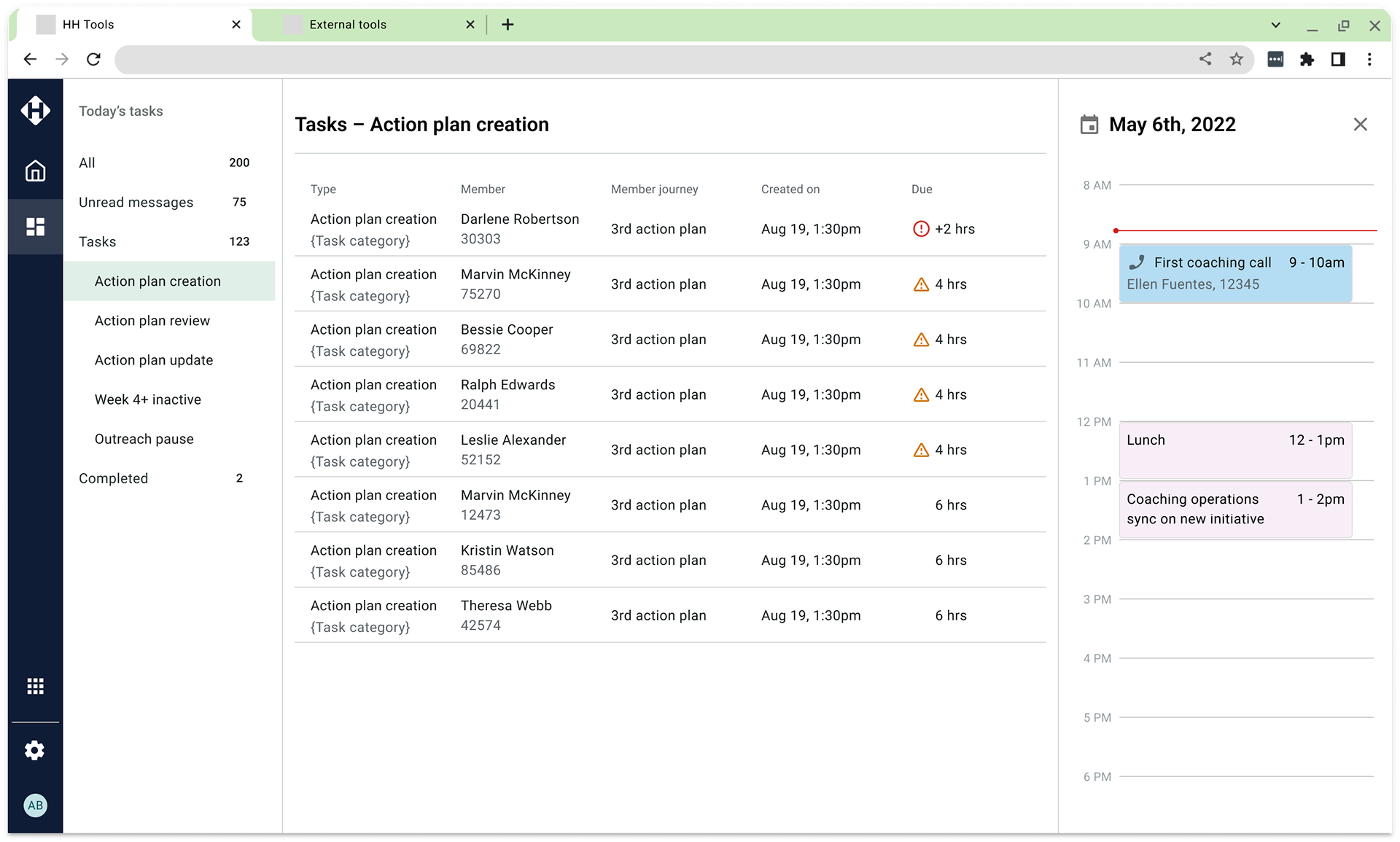
Simplified filtering based on the workflows with a sidebar.
The process - Handoff
The MLP
After gathering feedback from users and stakeholders, I introduced a new dashboard design tailored to the unique workflow needs of coaches. The initial release (Minimum Lovable Product) featured a sidebar with simplified sorting, focusing on sorting Unread Messages and Tasks.
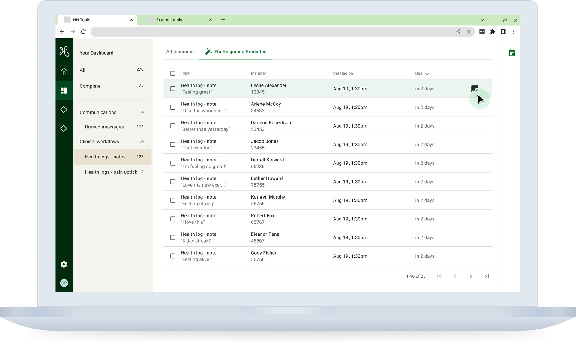
Version 2
In response to user feedback and evolving requirements, the design quickly evolved in Version 2 to include more advanced filtering capabilities, leveraging machine learning to enhance the user experience. We also took proactive measures to address performance concerns, implementing pagination for smoother loading and optimal functionality, even with a high volume of workflows.
Results and conclusion
The Coach Dashboard project effectively tackled the unique challenges of managing high-volume workflows. After release, coaches provided positive feedback, emphasizing enhanced user-friendliness, more efficient task management, and the integration of information in a single, accessible location.
Next, we need to apply the new patterns from the coach dashboard to the PT dashboard.

